FareHarbor Experiences

Improving end users' customer journey on clients' websites

Project Outline

OVERVIEW

FareHarbor is a booking and reservation software platform that helps tour and activity operators manage their business operations, such as online bookings, payment processing, customer management, and reporting. 

As a Customer Experience Account Manager with more than 700 clients across Europe, I apply my design thinking mindset and research skills to make my clients grow their online presence and booking conversion rates. The goal of this project session is to showcase my methods and thinking process to make my clients get the best out of FareHarbor’s software and services.
ROLE

Customer Experience Account Manager
Design thinking, customer journey analysis, data analysis

October 2021 - Present

Spotting the Opportunity

First, I start checking clients’ google analytics and conversion funnel reports to spot pain points in the booking process

With the Google Analytics behavior report, for example, I can spot an unexpected high bounce rate on a specific page, as you can see below:
The Star Wars Tour in Ireland has a bounce rate of 86,36%, which is not normal compared to the client's average bounce rate of 37,16%. This for sure might be worth investigating more. 

And with the conversion funnel report (below), I notice that only 48% of the people that visit the booking flow happen to choose a date to book, and when visiting the book form page, only 38% select a ticket option, so this is also a potential issue that might be affecting the client conversion rates.
I also use the overall conversion metrics to compare the performance between my clients and have an idea of what is a good or bad conversion rate for their industry:
In the example above, the first and second clients have a below average conversion rate compared to the average of all my clients (11.24%). All the data allows me to make a data driver choice about clients I will work with on a specific period of time.

'Be The Booker' Process

After spotting the issues with quantitative data, I visit the clients’ website and pretend I am booking to check the customer journey and verify if the software implementation is optimised. This process can also happen without checking previously quantitative data. 

My goal is to do the following: 

• Find a book now button
• Choose a product (usually aiming to find a best seller) to book
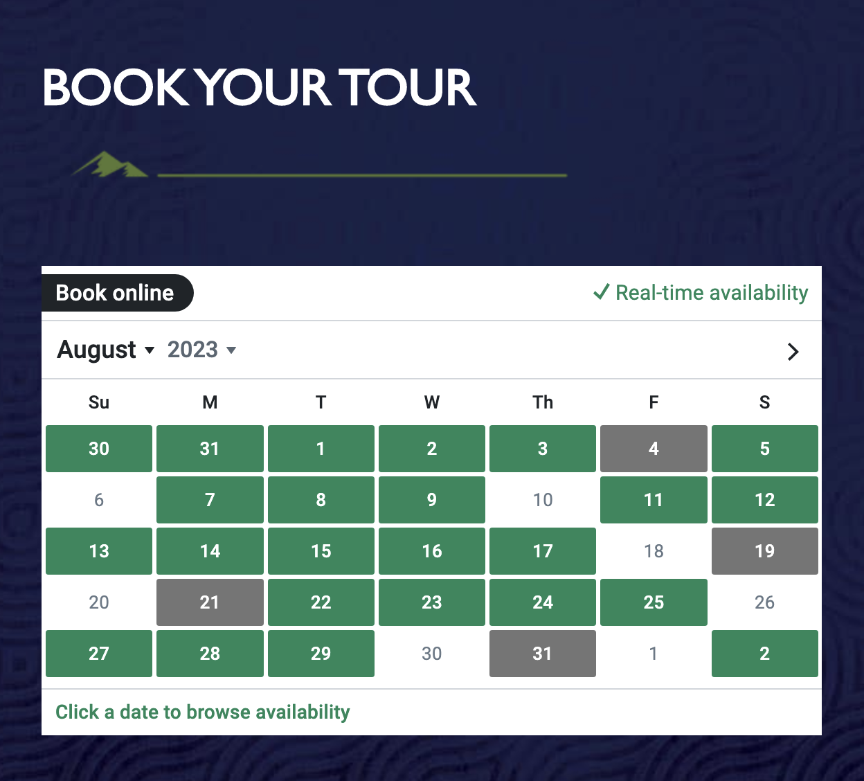
• Pick a date
• Choose a ticket option
• ‘Complete the booking’ 

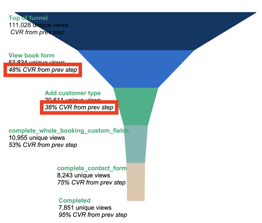
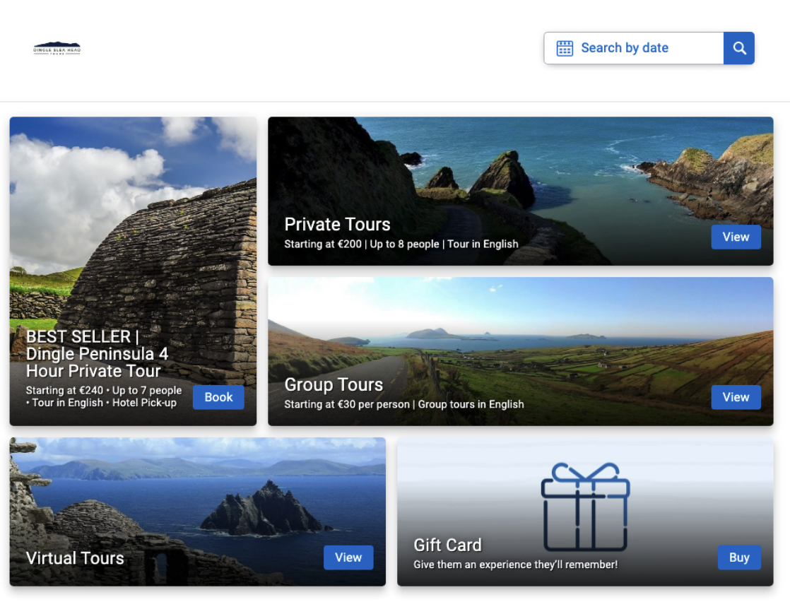
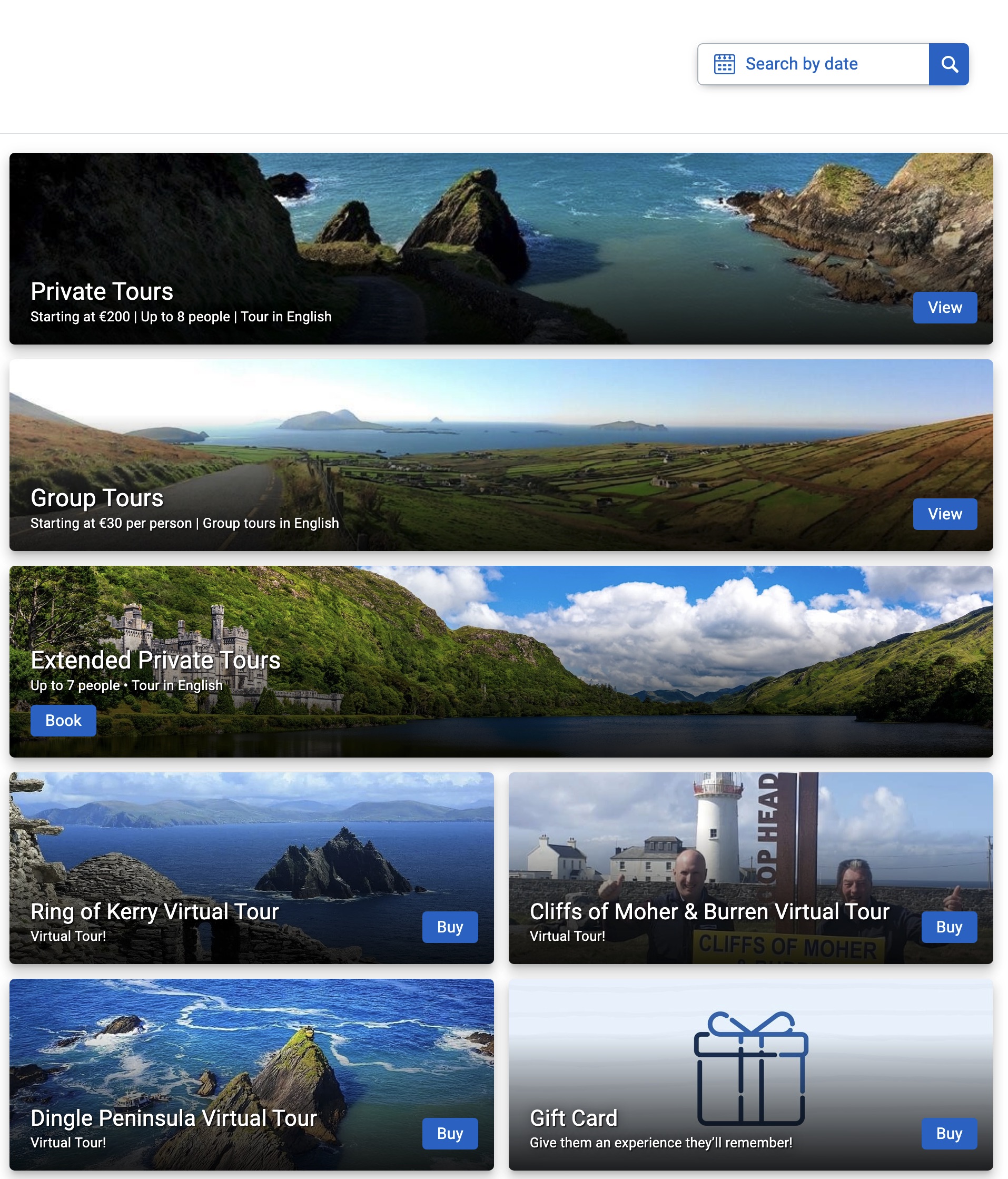
Clients are onboarded at FareHarbor optimized for success, but with time some updates like creating new items might not be implemented as it should. For example, I can come across to booking flows with too many options as the one below, that might explain only 48% of people clicking to choose a date:
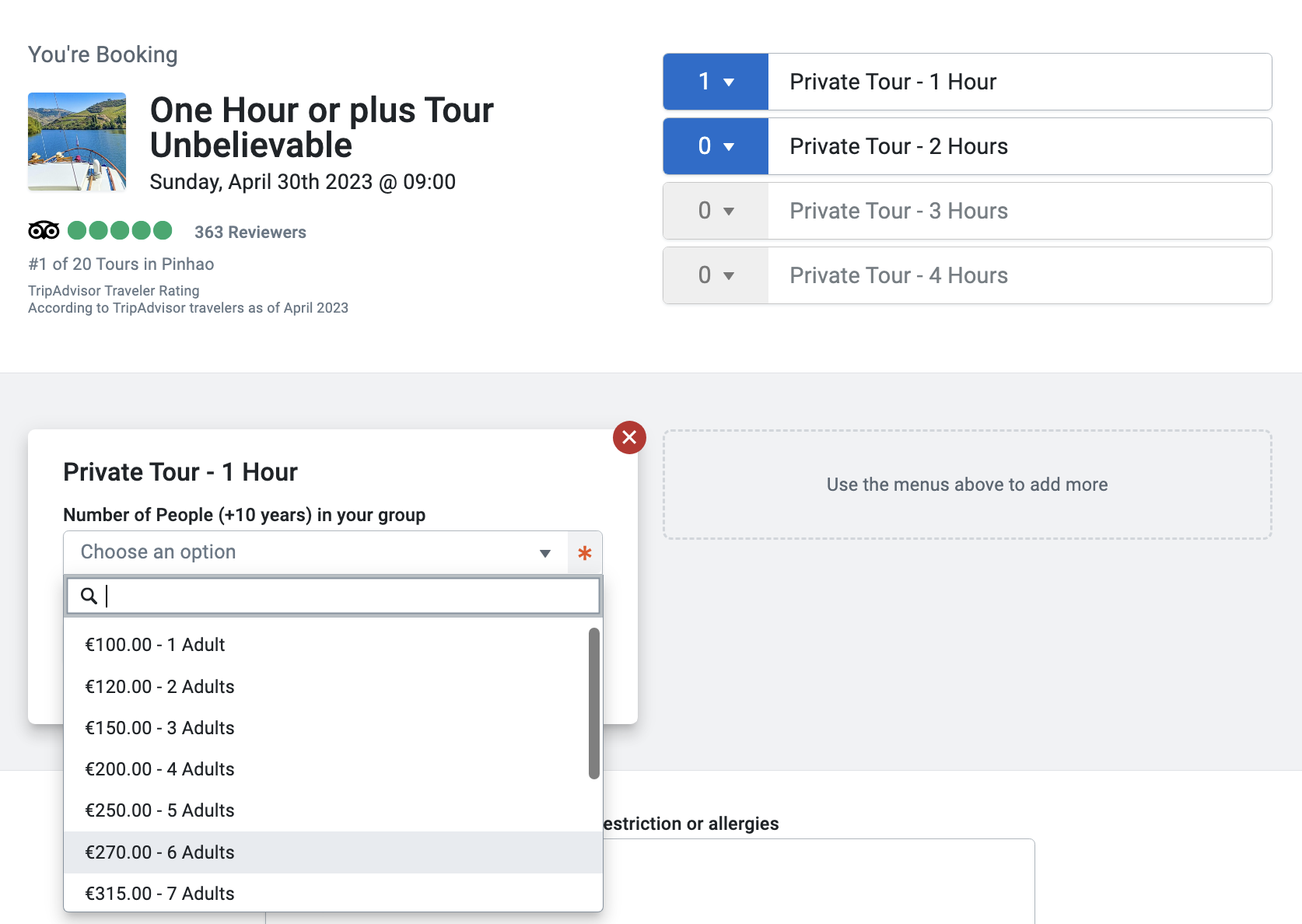
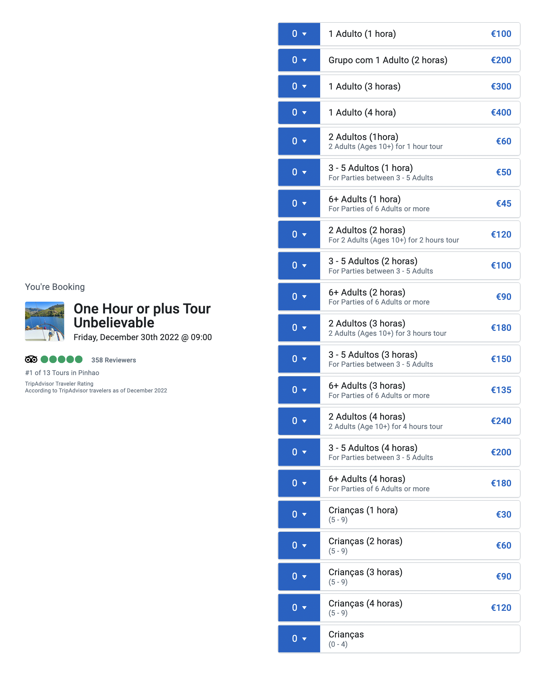
Or spot a book form with more than 21 ticket options, mixing languages (really Unbelievable!), that can explain the percentage of only 38% of people choosing a ticket option:
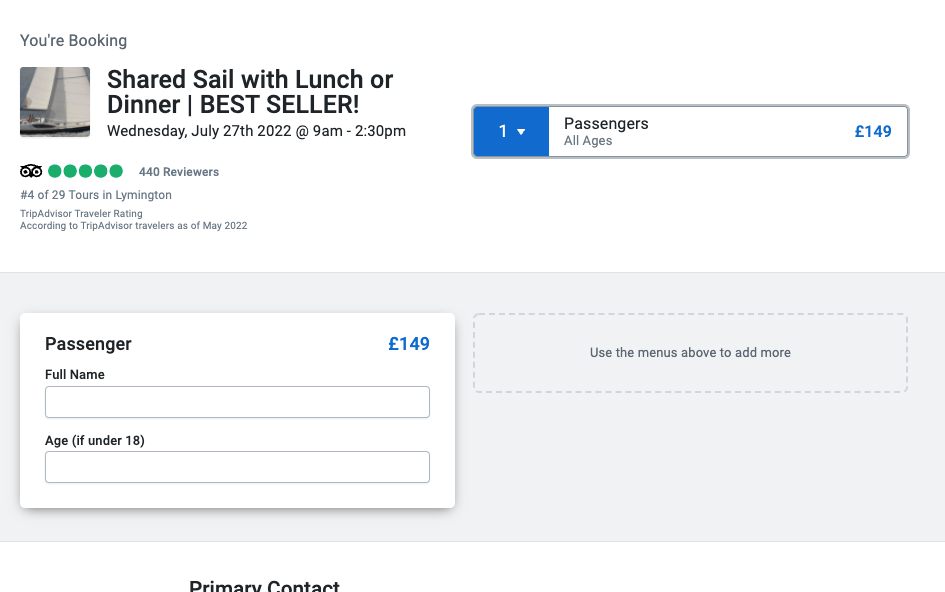
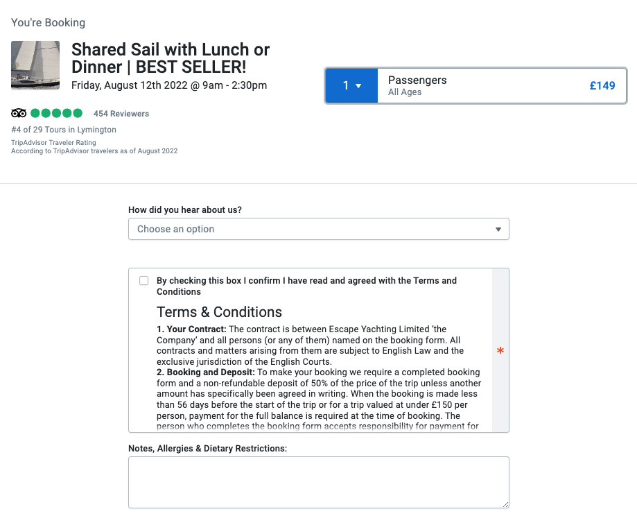
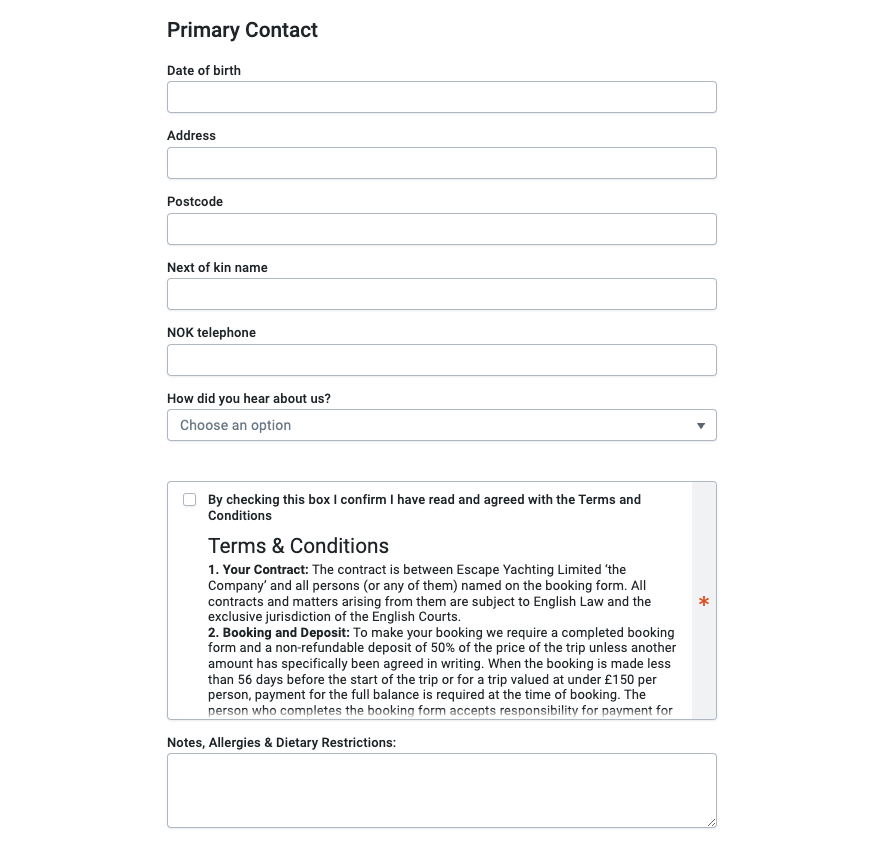
And last but not least, find out the client is asking too many questions:
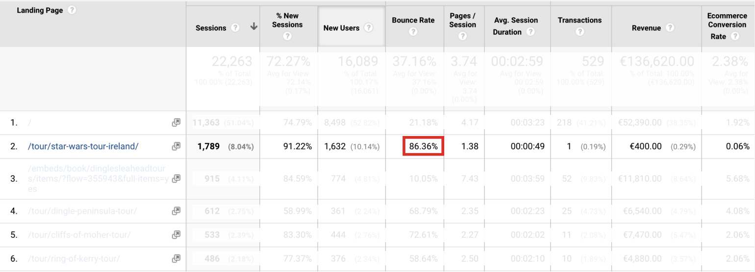
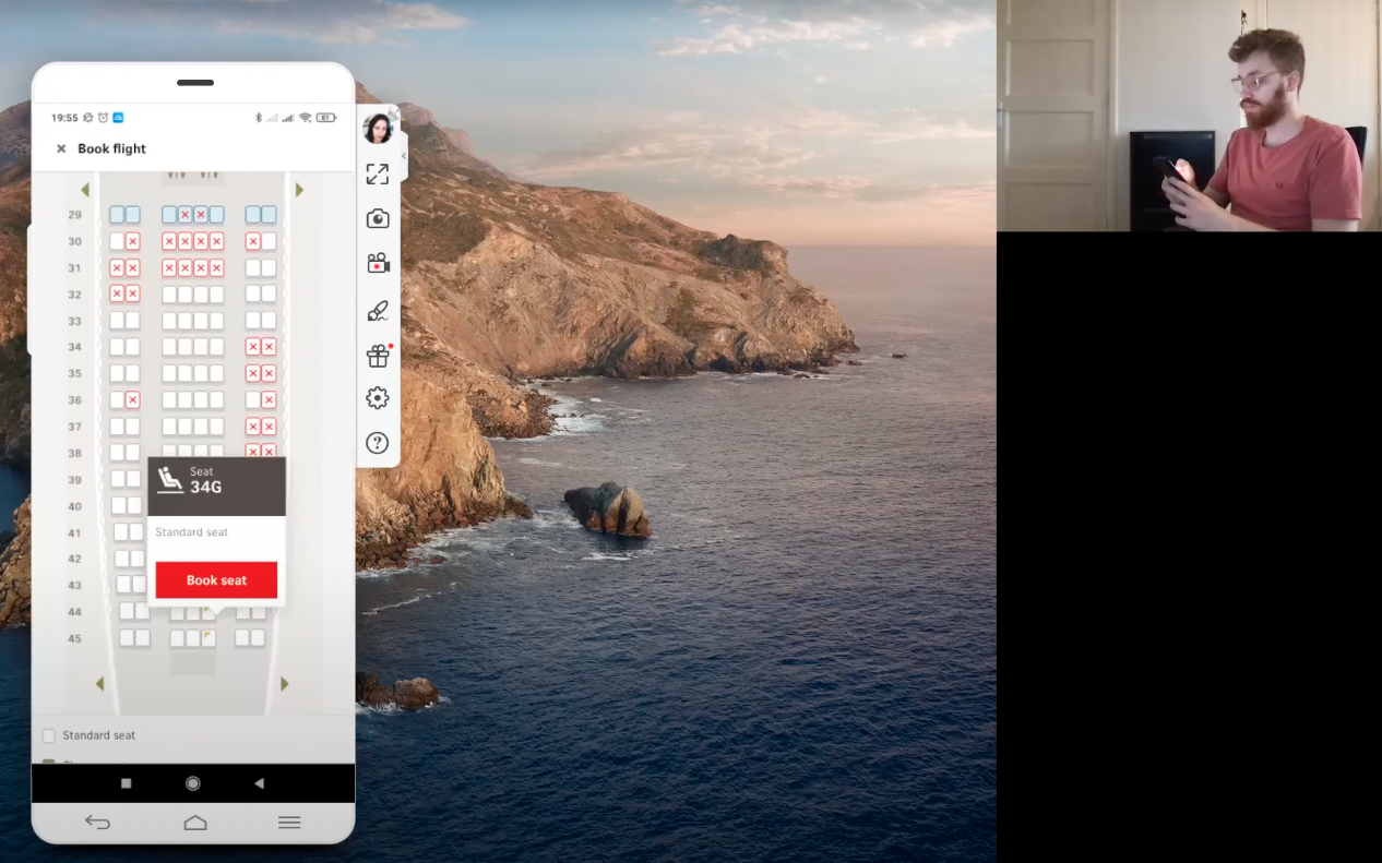
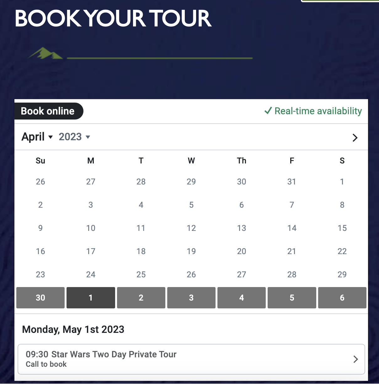
If I spotted an specific issue on a specific page (i.e the Star Wars high bounce rate), I jump on directly there. For this specific case, I realize that all calendar is ‘call to book’, so the reason why people are leaving the page (86%) is because they can’t book online:
If the clients’ website presents issues in the customer journey process like the ones I mentioned above, it means that usually I failed at completing the goal of making a booking with success due to confusion, fatigue, lack or too much information and required options to book.

Implementing Improvement Opportunities

When the issues are clear, it’s time to apply usability and design thinking principles to improve the customer experience on the client’s website. 

After clicking to book, the booking flow page is adjusted to highlight the best seller, segments the tours properly and does not contain more than 5 options to avoid fatigue, as you can see below:
When picking up a date, I make sure the dates are available online (options in green):
Once picking up a date, I make sure the ticket options are concise and straightforward. You can notice that from 21 ticket options we went down to 4, and the adults can now be chosen after the customer selects for how long it’s going to be their tour:
Also, to make sure there’s only relevant information on the current task, I remove unimportant add ons and questions from the book form (date of birth, address and kin number are details that can be collected afterwards to avoid fatigue or from google analytics on a more generic way for demographic information):
After implementing the changes, the end user is able to complete the goal of booking much easier.

Seeing The Impact On Clients Businesses

To prove the changes I applied really improved the customer journey through the booking process and therefore the client’s booking conversion rates, I usually compare periods before and after the changes and use e-commerce conversion rates and online revenue for example to draw conclusions, as you can see below:  
The example above is the metrics for only removing unnecessary add ons and questions from the book form. You can see the client had 264% revenue growth and the company had an increase of 312% of booking fees. The results are usually presented internally to my team and externally via business reviews.

Next Projects

Let's get in touch!