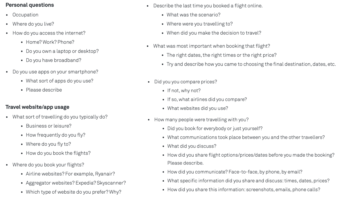
Finding Patterns and Unveiling The Journey
To make sense of all data, I applied triangulation to interpret the research findings. I gathered all the data in an affinity diagram.
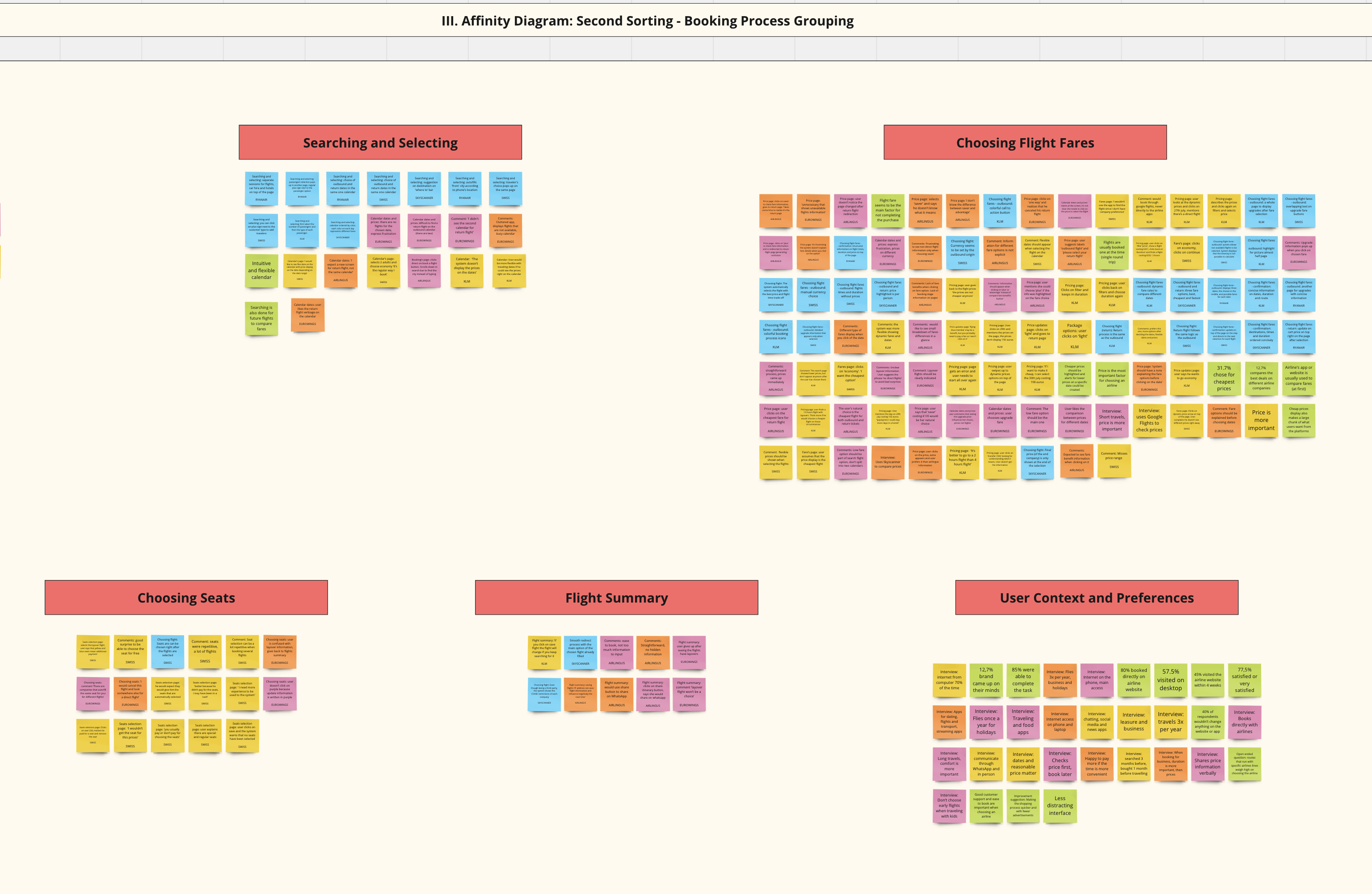
With a friend’s help I ran a 2h session in Miro with sticky notes from research findings. The diagram was mostly focused on understanding the strong and pain points, user behavior, mental models, suggestions and the the elements of price. Below, you can see a partial screenshot of the diagram (phrase 3, booking process groupinh):
And then, I replicated the insights on user flow in a customer journey map. As an interpretation of the affinity diagram, the map is a visual of the customer's goals, behaviors, pain points, positive interactions and mental models on each journey step. It’s structured in columns, rows and processes. You can check the customer journey map below:
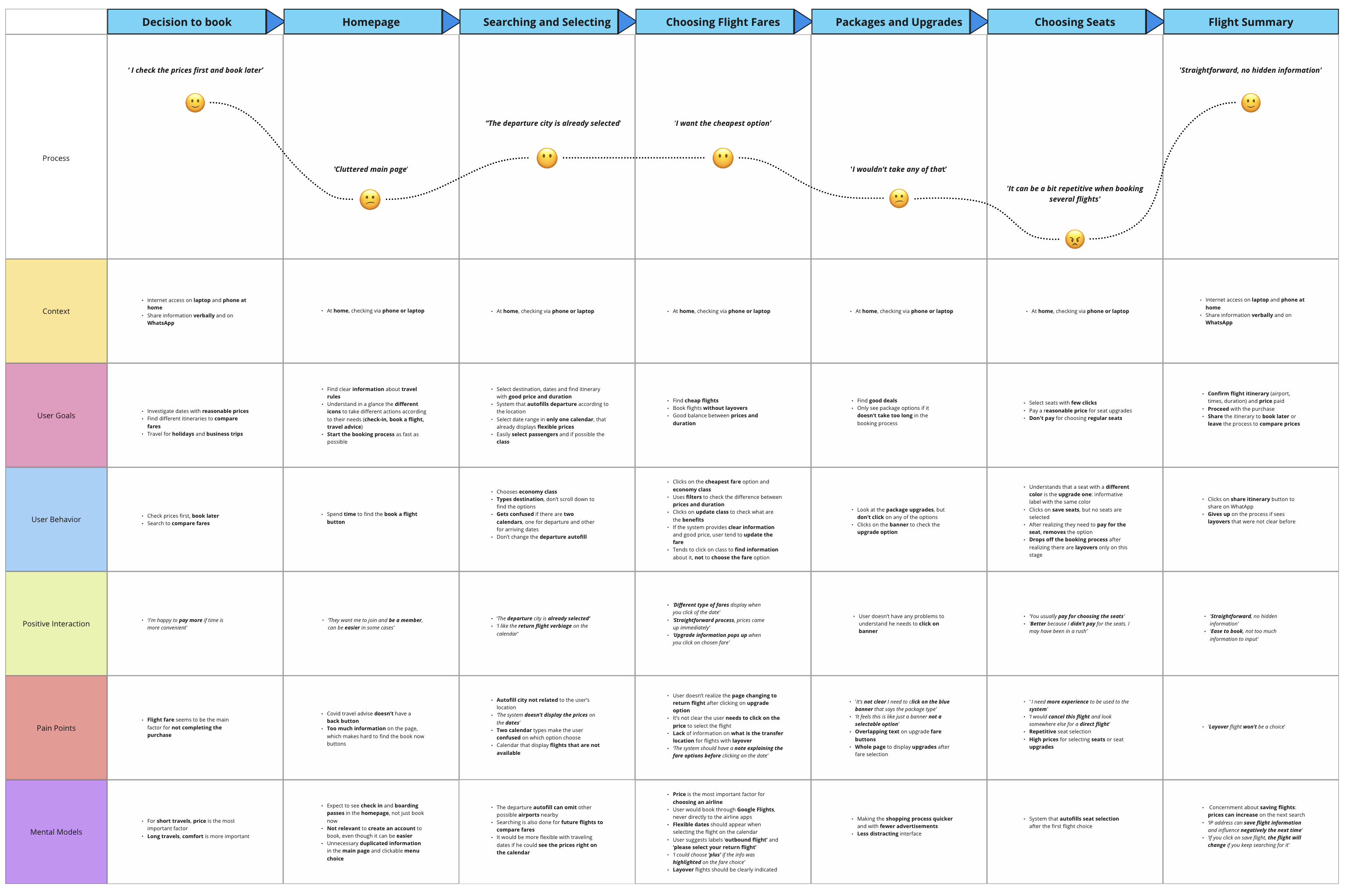
CUSTOMER JOURNEY MAP MAIN CONSIDERATIONS
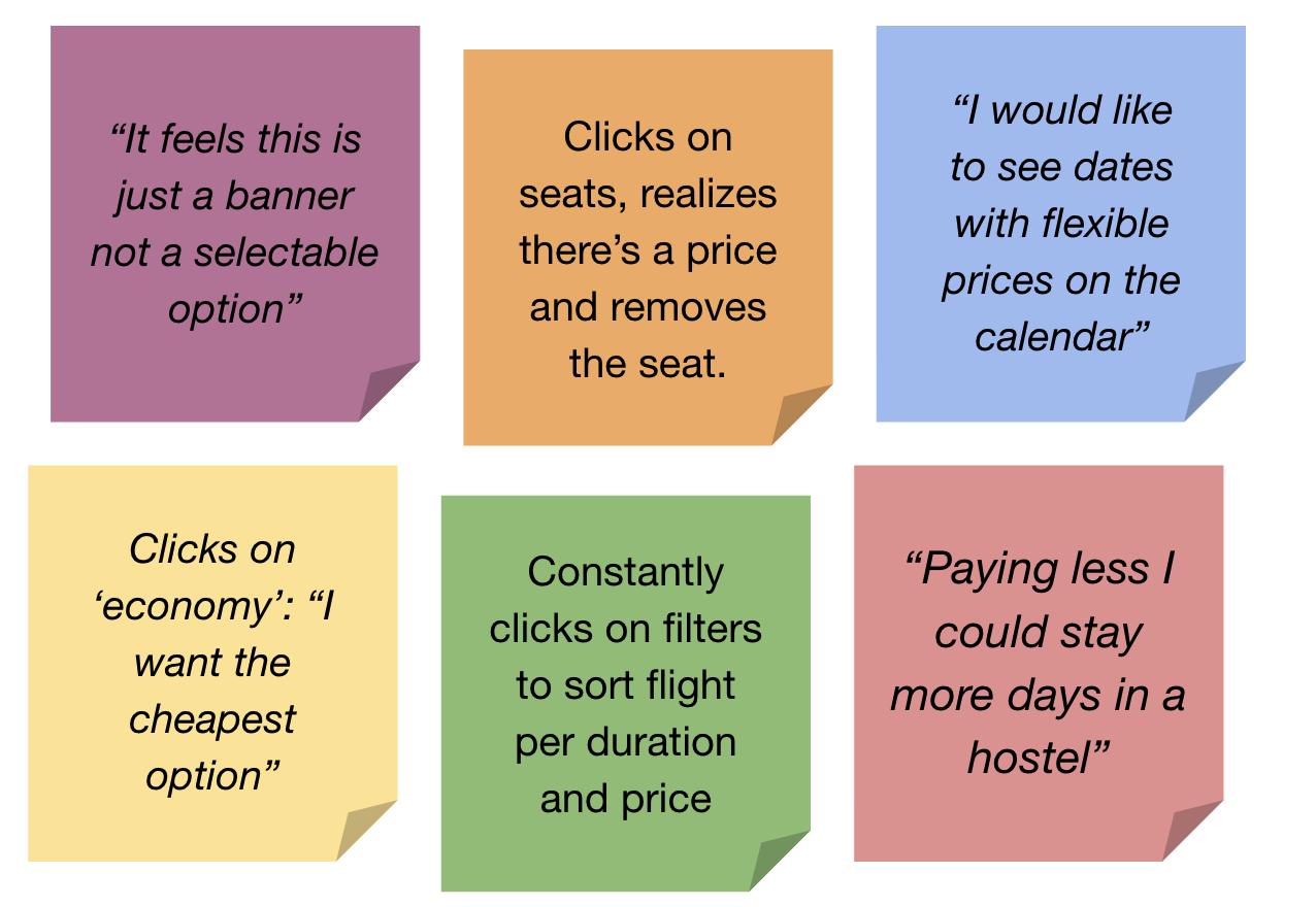
• User Starts probing prices to book later.
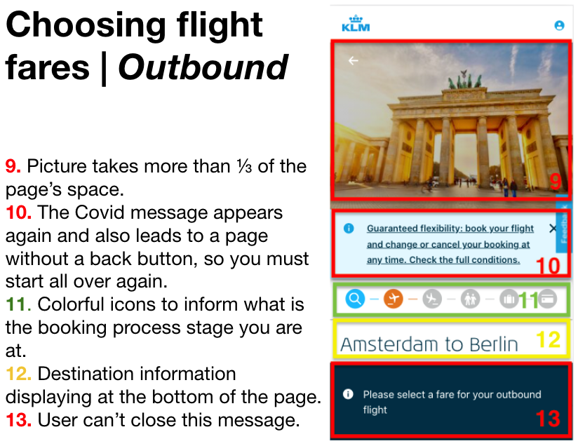
• Cluttered icons and navigation are not providing a good experience to start booking.
• Journey gets better when the app predicts behavior (i.e. departure autofilled).
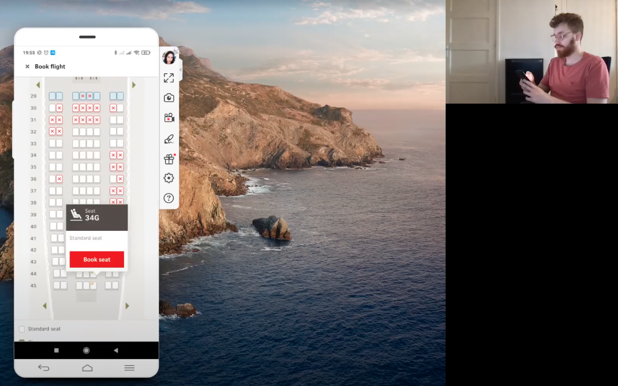
• Package upgrades and seat selection are boring.
• Clear flight summary makes the experience ‘straightforward’.
With the clear mapping, a design team would be able to create an app that has an initial browsing experience that is intuitive and engaging, addressing the issue of cluttered icons and navigation. Additionally, the team should focus on implementing behavior prediction features, such as autofilling departure details, to enhance the user journey. Furthermore, consider ways to make package upgrades and seat selection more appealing and interactive to keep users engaged and also prioritize creating a clear flight summary that presents information in a straightforward manner, as it greatly enhances the overall user experience.